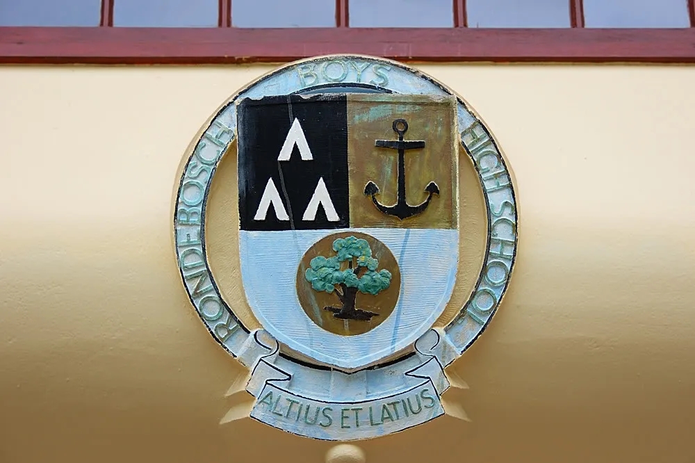
Rondebosch School Images

I was briefly in Cape Town on 22 November 2007, and took the opportunity to visit my Old School. I am an ‘E75’.
The purpose of this web page is merely to share the photographs I took during a half hour visit in a sort of brief ‘photo essay’. I hope you enjoy them. Please feel free to right click and copy these photographs if you want to use them for a school related project.
As an added bonus, I was able to have a delightful and interesting chat with Prof Heyns who I found watching the boys in the school pool. He has just celebrated his 83rd birthday! I still fondly remember being coached by him for under13 rugby in 1971 and being taught Geometry by him in the same year. As you all know, he was at the time the Professor of Education at UCT.
.
.
.
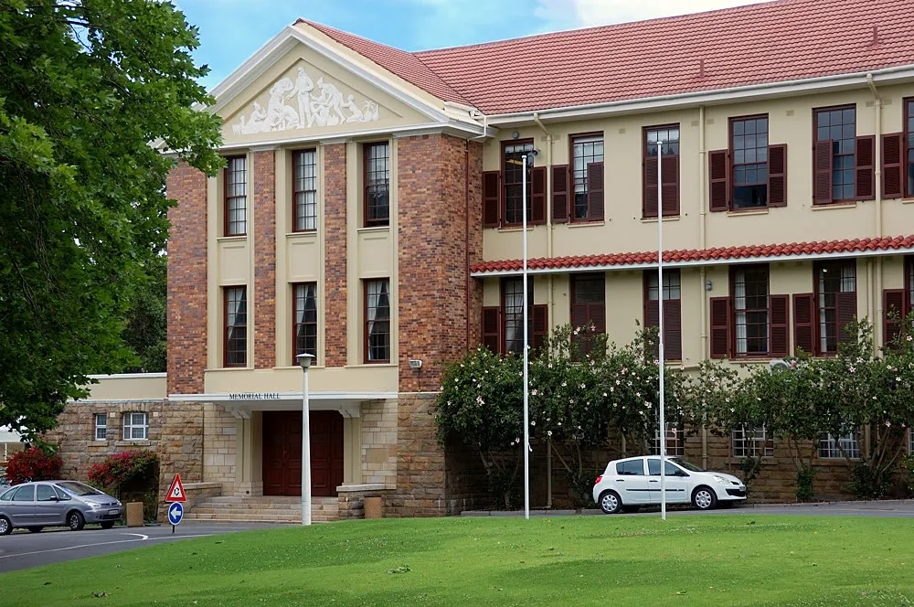
First stop was the Memorial Hall, a really special place at the centre of the school. Even after 32 years it has very strong associations for me.
The centre-piece is impossible to walk past without observing due reverence.
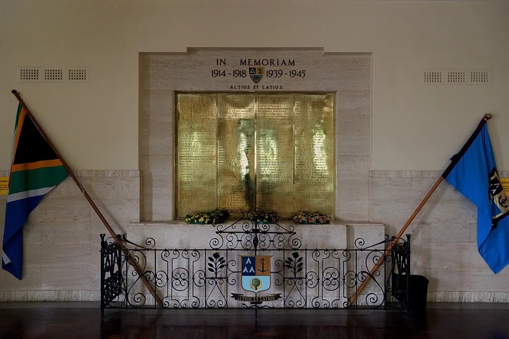
One hundred and sixty of them.
.
.
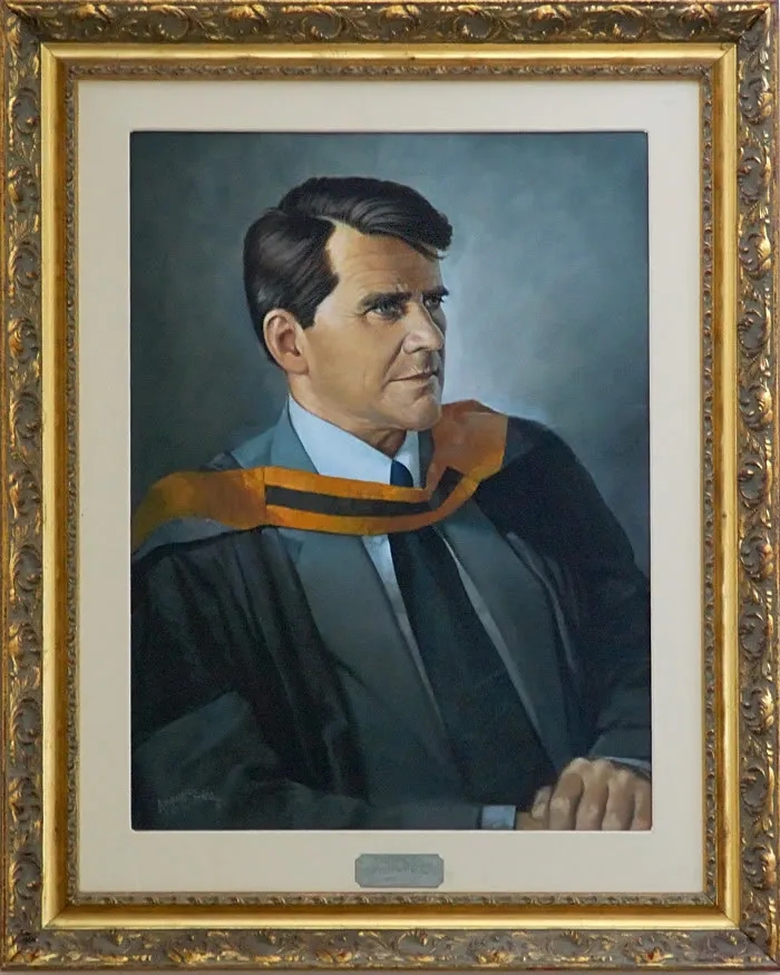
On the staircase is the portrait of the Headmaster, Cecil Clement, whose tenure covered my years at the High School.
It was disturbingly accurate in its portrayal – the wrinkles around the lips I can almost exactly remember!
Curiously, the plaque was almost illegible.
.
.
The midday sun was streaming in the side windows of the Memorial Hall and the heavy drapes were pulled back. Apart from the greasy spots left by a thousand heads, the Hall (opened in 1951) has worn well ! 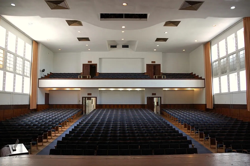
![]()
If I remember correctly, there is a very different atmosphere with the drapes closed, or in the evening.
In my day, it was the first choice for CAPAB’s productions when the Nico Malan Theatre (Artscape today) wasn’t available.
Apparently, in the 1950s it was the best auditorium in the Cape Province!
Prof Heyns tells me that the Projection Room, whose windows you can see in this picture, is an ‘artefact of a bygone era’.
Movies in the Memorial Hall were a big thing in my day.
.
And the more usual view, so familiar to every schoolboy:
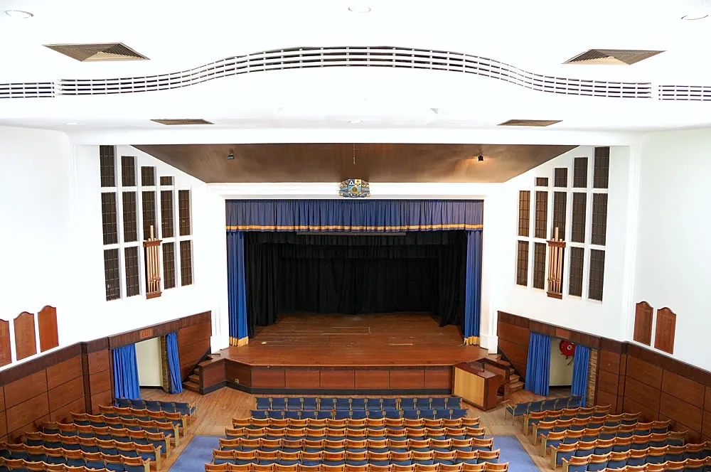
Apart from the extra 36 seats it looks much the way it always did.
If the orchestra pit is still utilised, those extra seats would surely fall into it?
The faux organ pipes are also ‘new’. In my day, it was understood that the ‘windows’ on either side of the stage were intended for tiered organ pipes at a later date. The ones that are now there look a little lost and inadequate.
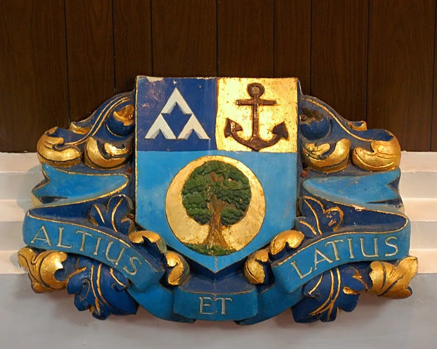
The beautifully gilded, relief plaster school crest above the stage is what transforms this view from just an impersonal theatre into the Rondebosch Memorial Hall.
Light Blue, Dark Blue and Gold…
![]()
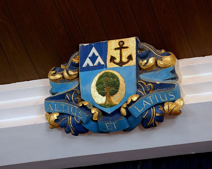
…or more geometrically correct:
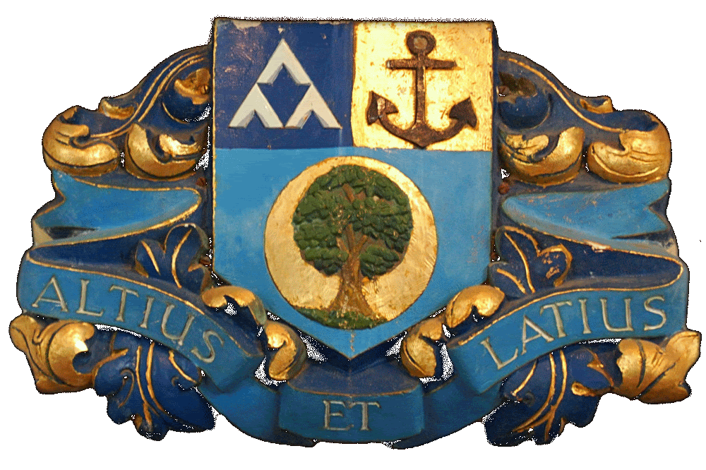
The school houses were called just that, Light Blue, Dark Blue and Gold, until 1945 when they were given their present names, together with the red Canigou for boarders. I’m told that a new house was created in 1994 called Ramage (after the first Headmaster. )
If you have an eye for minor detail, you can see the six screws that hold the crest in place. I never saw those before this photograph!
.
These seats still look exactly as they always did, uncannily emotive furniture…
![]()

What more can I say…..?
.
.
The windows facing the main foyer of the school always had a pleasing shape and in 1964 these secular, stained glass windows were installed. They were commisioned from Lawrence Lee, the U.K.’s Glass Master at the Royal College of Art and co-designer of windows at the rebuilt Coventry Cathedral.
The salt-glazed, face bricks have been painted! Naturally, I prefer them the rich colour they were.
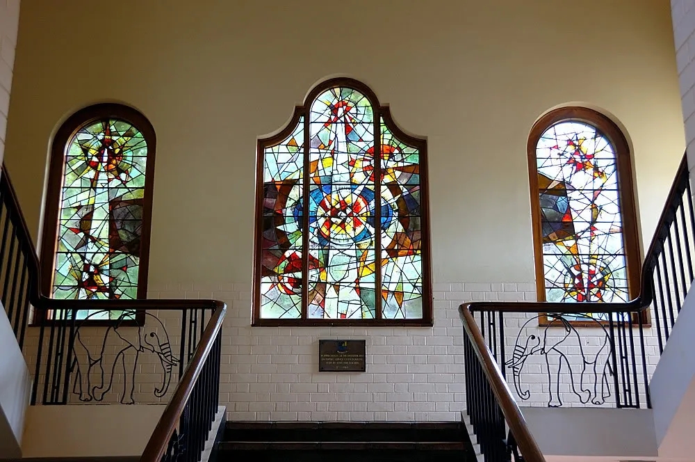
As a schoolboy, I never had a clue what their abstract design was meant to depict .
I read with fascination now, that what they actually depict is: “explosions of understanding in the scholars’ minds”. OK.
I prefer:
“IN APPRECIATION OF THE UNSELFISH AND UNSTINTING SERVICE GIVEN DOWN THE YEARS BY MANY FINE TEACHERS”
It is probably only in retrospect that I realise how apposite that tribute is.
.
.
And then, taking 20 steps backwards gets you out onto the stone portico below the headmasters office.
When I satrted at RBHS this wasn’t the headmaster’s office, it was variously the “Reading Room” and the “German Room” with Herbie Helm as the incumbent.
We used to play chess in there at break.
It was beautifully panelled with dark wood and featured that lovely oriel window above the school’s main entrane.
(It is possible that this architectural feature was meant to mirror the similar oriel window above the main entrance to the Prep School?)
Cecil Clement saw its potential and moved his office from downstairs (where the receptionists are now) to there.
It is still the Headmaster’s Office today.
My last visit there, was to be caned on the final day of matric.
The room next door to it was the Prefect’s Room, but was converted to be the Headmaster’s secretary’s office. I remember it as the only room in the school with a fireplace (maybe the old Headmaster’s Office directly below it also has a fireplace?)
The prefects moved to the old Armoury. A school actually had an “armoury” (rifles and all) in those days. (And we were conscripted for two years after leaving school.)
Hopefully, the militaristic concept of “cadets” has faded away forever.
.
Outside the window of the Headmaster’s office is the school bell.
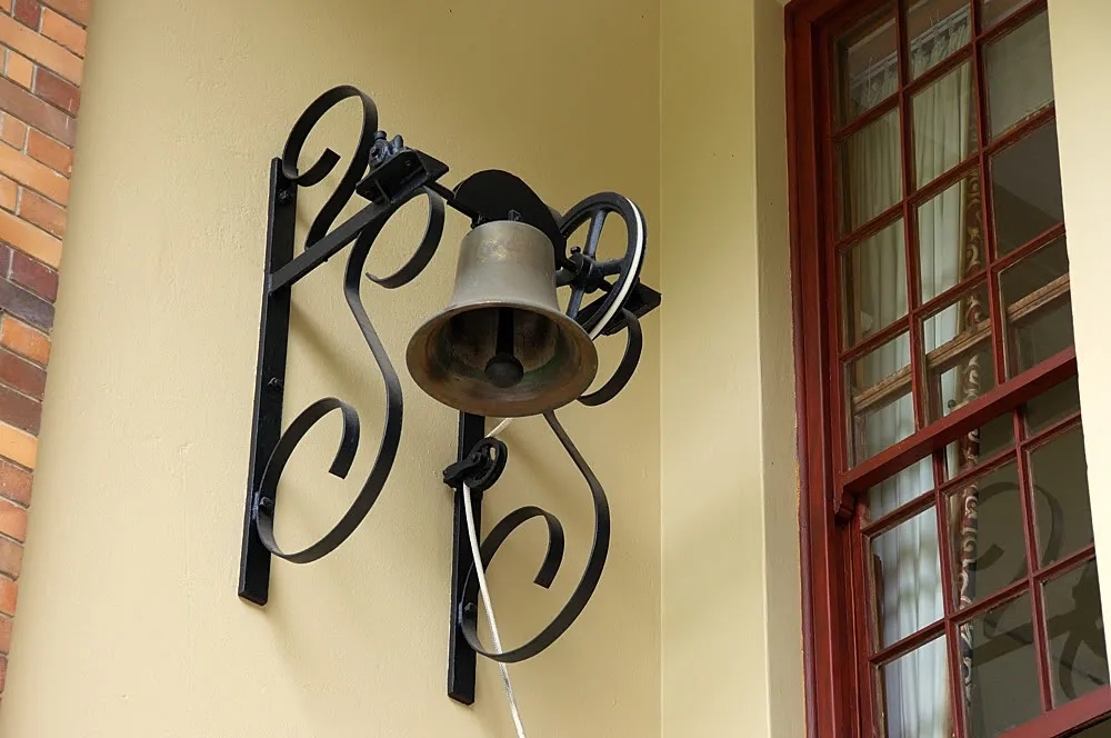
Today it appears to have a new rope ending inside the Headmaster’s office, but in my day it was rather more symbolic. Although I think it may have been rung at Valedictory, it wasn’t in routine use. (Wanting to ring it was a temptation to every schoolboy though!)
.
More of the wonderful relief plaster work favoured by Wally Mears and the architect Kilgour Parker, himself an Old Boy.
Again, it just lifts these buildings out of the ordinary and provides the sort of iconography that forges loyalties.
.
.
And stepping further backwards, the neo-classical facade of the school, terminating in the formal entrance to the Memorial Hall. The Hall was ‘grafted on’ to the end of the 1946 buildings in 1950, completeing Wally Mears’ and Kilgour Parker’s vision.
“He uses the classical pediment with decorative relief panels with references to colonial history, supported on symbolic brick pilasters rising from a rusticated sandstone plinth, and a projecting eaves course of tiles at first floor, for sun control and modelling the facade.”
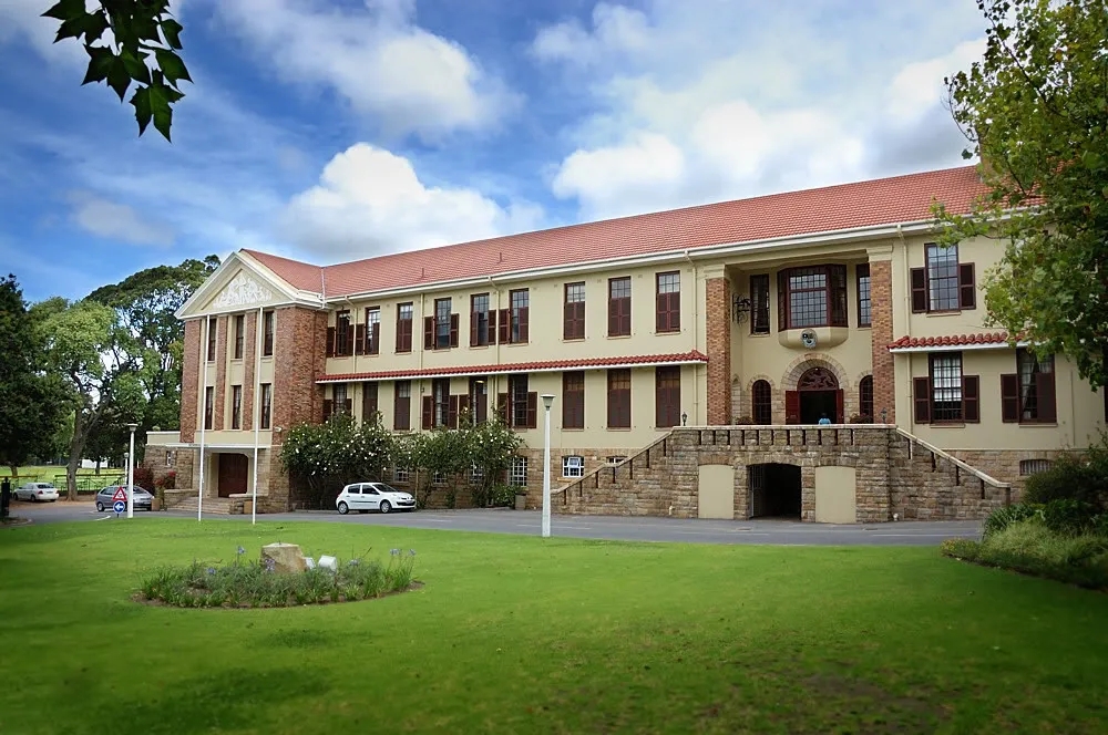
Alas, this is just a snap, taken at 14h00 – the worst time of the day for a photograph, with the light coming from behind the school (I have post-processed it to give the opposite impression). There was nobody to arrange the shutters neatly for me either!
The circular flowerbed in the middle of the lawn used to have a huge blackwood in it that was taken down while I was at the high school.
.
.
The Clocktower is another of Parker’s design features that the years have turned into a familiar icon of the school, remembered especially by those thousands of boys whose bicycles entered the school from the Canigou Avenue pedestrian gate.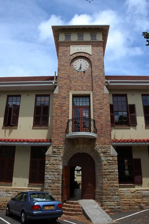
Actually, there are numerous outdoor clocks around the school. With the exception of the swimming pool changing room clock they no longer work. (Prof Heyns explained to me they were too expensive to fix.)
Unfortunately, the dyssynchrony of the hands in this clock just makes it look broken. (If the hands just showed a synchronised 3 o’ clock it might look better.)
I can’t help feeling though, that if you have a Clock Tower as a significant architectural feature, ( a symbol of the school no less) you should do whatever it takes to make the clock actually work. Even the birds have sensed the neglect and are currently nesting at 5 o’clock!
Likewise, the wheel chair ramp in raw cement and untidily chopped into the original brickwork of the hemispherical staircase is very unsympathetic to the original architecture. It’s difficult to miss too, as you enter or exit the door. It just looks like a horrible modern defacement.
Budgetry constraints are always used to explain these shortcomings, but during my visit I was witness to a new R4.1m swimming pool being added to the existing one.
.
.
Here is another of Kilgour Parker’s famous features, the entrance to the new Canigou after the original building was demolished in 1940. It’s a bit grown in, making it difficult to photograph nicely. The entrance with its lion fountain holds a very special place in the hearts of thousands of boarders.
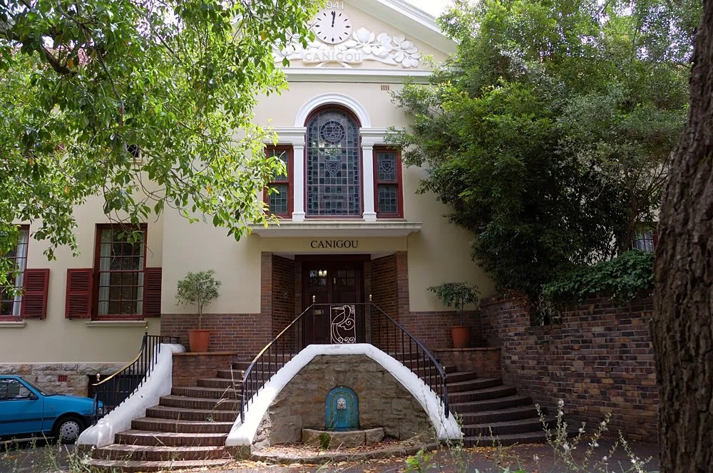
Although this clock isn’t working, it just appears innaccurate rather than broken.
I have always wondered whether that brick wall on the right was part of the original design. It seems odd to squash such a stately entrance into a corner.
.
.
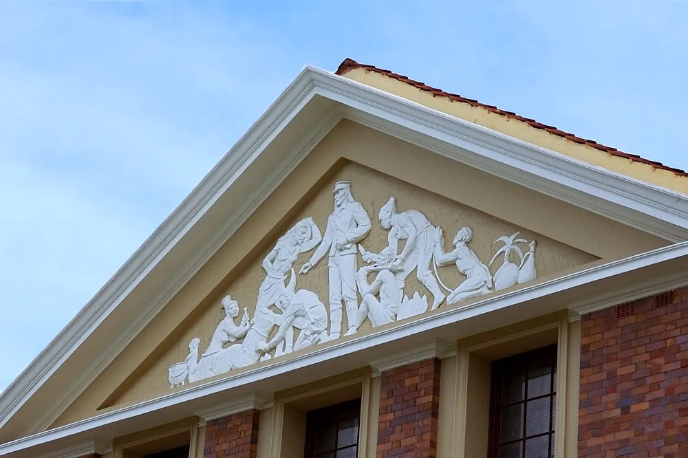
Another of Kilgour Parker’s inspirations was to use the talents of local artists to decorate his architectural canvas. I have already shown some of the relief plaster work around the school but this reached its highest form with the work of the sculptor Ivan Mitford-Barberton. He was born the year before the school was started and from the 1930s was a lecturer at Michaelis.
Here is his “Emancipation of the Cape slaves” on one side of the Memorial Hall.
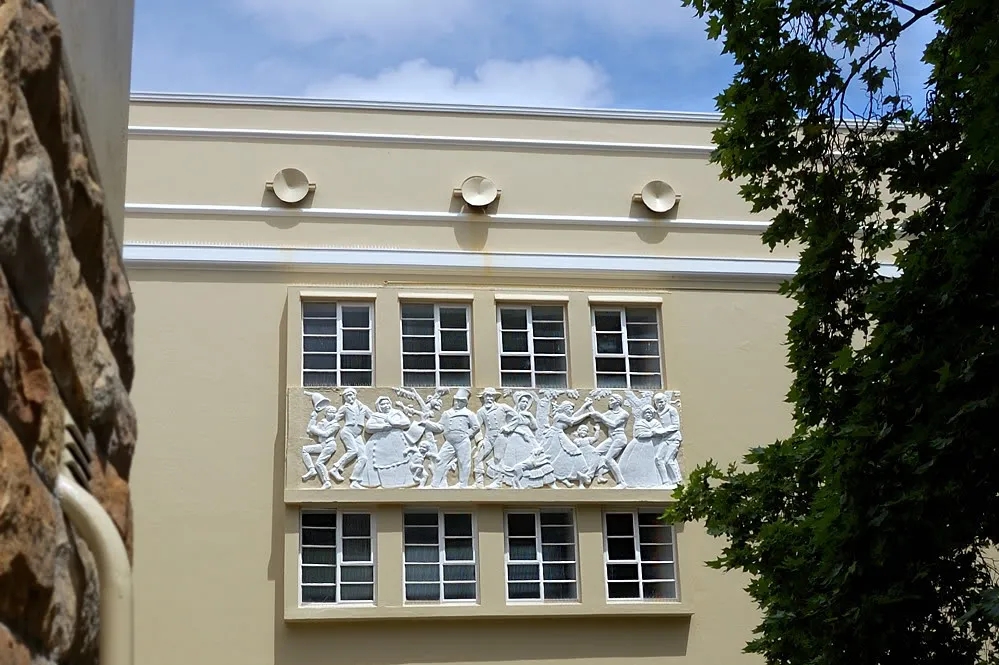
The other side has his depiction of hero Wolraad Woltemade.
I remember these relief works as a uniform white, which prevented the viewer from appreciating the full richness of the panel. I rather like the present clarity of detail afforded by the two tone finish.
Above the Memorial Hall is David Livingstone adorning the classical pediment.
Today it just looks rather too colonial. What is going on around the upright Englishman? I like the little guy and the potjie though.
.
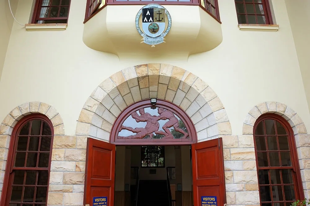
Mitford Barberton also contributed the teak carvings in the fanlights above several of the entrances to the school.
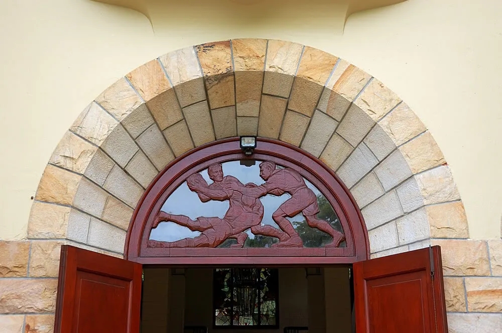
Can there be any doubt about the nature of the official school sport, so prominently depicted over the main entrance to the school!
.
.
Mitford-Barberton is also well known for his sculpture of the Leopard that overlooks Hout Bay from the rocks below Chapman’s Peak, the controversial statue of Jan Smuts at the top of Adderley Street, the statue of Jock of the Bushveld in front of the Barberton City Hall and the impressive granite frieze that goes around most of the art deco Mutual building in Cape Town, amongst many other works.
He died in 1976.
.
.
And then onto the pool where I found Prof Heyns
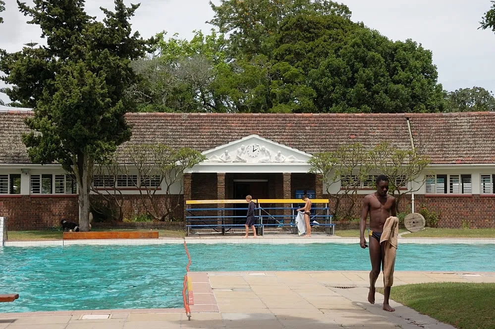
During my years at the high school, the deep end was widened for water polo, giving the pool its present L shape. It still looks like a great asset to the school and the changing room buildings have aged well. The clock works, so it can be done!
Behind me, the old Oakhurst Field was transformed into a building site, as a new pool is being constructed and will occupy at least half of the Field ,which has now gone forever.
This is all apparently progress, but I was left wondering why a school with only 800 pupils needs another huge pool, and exactly how many of them this monstrous addition was going to benefit? Was it worth losing the historic Oakhurst Field for?
.
.
.
.
At present I have no more photographs to share and I must emphasize that the foregoing were taken in less than half an hour. I no longer live in Cape Town, nor am I in any way associated with the school apart from being an Old Boy, so this was just a quick nostalgia trip for me.
I do have some other graphic content to share for those who may be interested in their own computer publishing for school projects or the like.
Here is the astounding, free-hand, illuminated calligraphy work of the school motto, done by Sister Anna Varena of All Saints’ Home in Cape Town in 1904, soon after the founding of the school.
Again, Light Blue, Dark Blue and Gold.
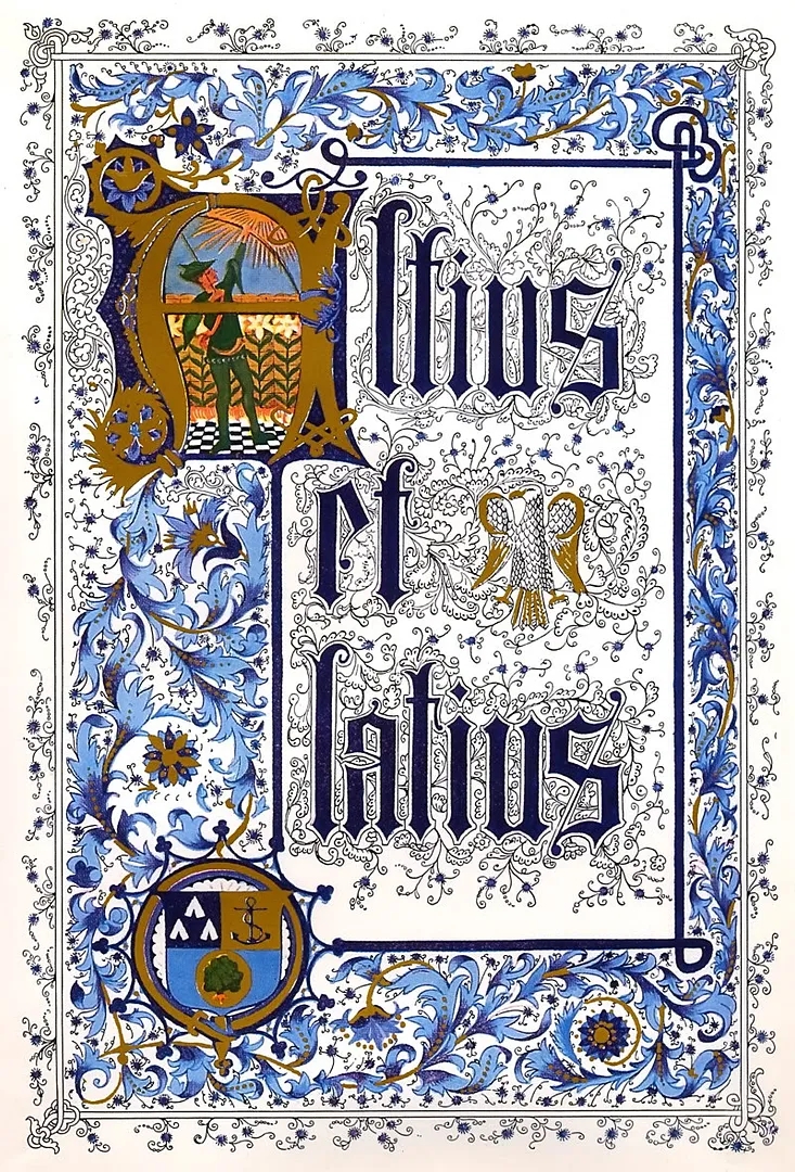
I first saw this beautiful work when I was 8 years old and at the Prep. It adorned one half of the “Certificate of Merit” I received for Arithmetic in Standard 1.
I am as impressed today by the detail of this work as I was then. Unfortunately the digital image doesn’t do the original gilt work full justice.
If you would like an even larger version (2111 x 3111 pixels, 2.8MB) you can download it here.
.
.
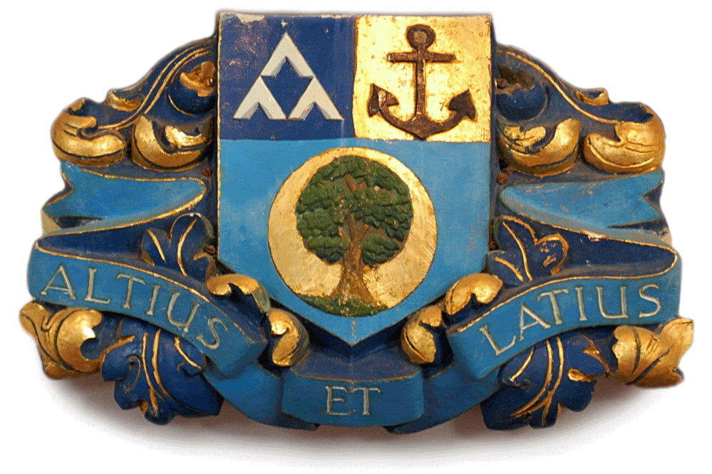
Here are some fully scalable .gif files with transparent backgrounds that can be inserted into Word, PowerPoint, Publisher or other documents to embellish them, like you would use clip art.
This one is for use on a dark background:
and this one for use on a light background:
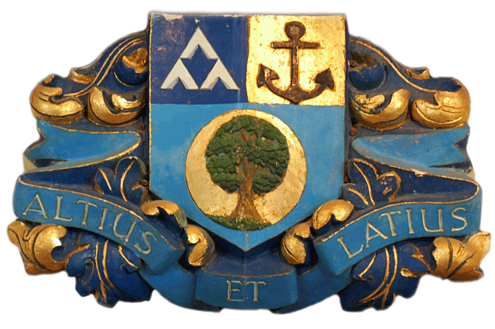
and this one retains its own shadow, reinforcing the 3 dimensional look, for use on white background only:
![]()
![]()
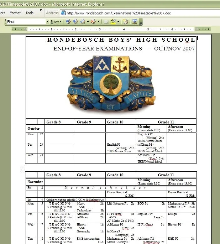
like this, with apologies to a document I found on the school website:
![]()
Not really the sort of document on which you would use it, but you get the idea.
.
And another one, for use on a dark background:
…and on a light background:

.
.
.
And finally, here’s the frontispiece for the School Magazine of 1975:
![]()
![]()

It was taken by me as a matric pupil 32 years ago, from the top of the Norfolk Island Pine that grows in the Canigou garden. I would like to try and do that again but I don’t know if I’m still up to it. I can remember it was a bit scary up there!
Donovan de Villiers, E75
.
![]()
![]()

25 Comments
Jump to comment form | comment rss [?] | trackback uri [?]